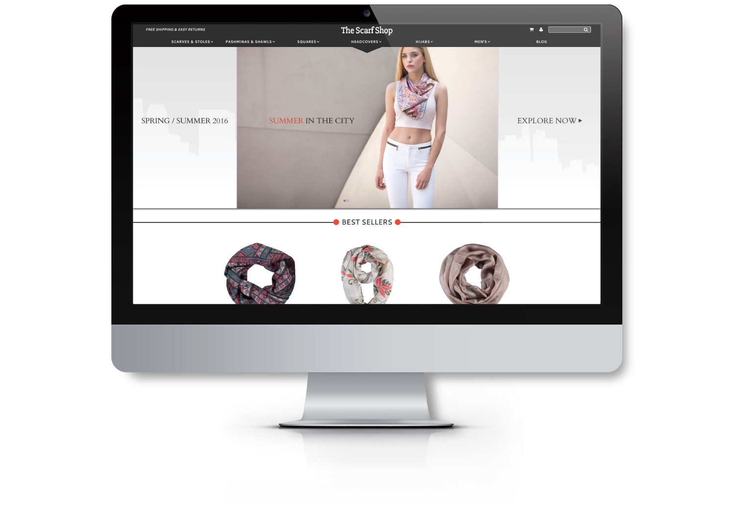
The Scarf Shop is a new eCommerce site that sells high-quality scarves in many materials, colors, and patterns. When they reached out to EYEMAGINE, their site had not yet launched and they wanted help building their contact list and generating interest in their new site. This presented an interesting challenge for the EYEMAGINE team since The Scarf Shop had no historical customer data or analytics to work off of. As a result, we had to use a little bit of trial and error, ultimately creating an optimized landing page with high conversion rates that worked to turn their traffic into valuable leads and contacts. This work won the Interactive Media Council's 2016 Best In Class Award.
![]()
Landing page submission rate increased by 222% and the new contacts rate increased by 230%. Here is how EYEMAGINE did it.
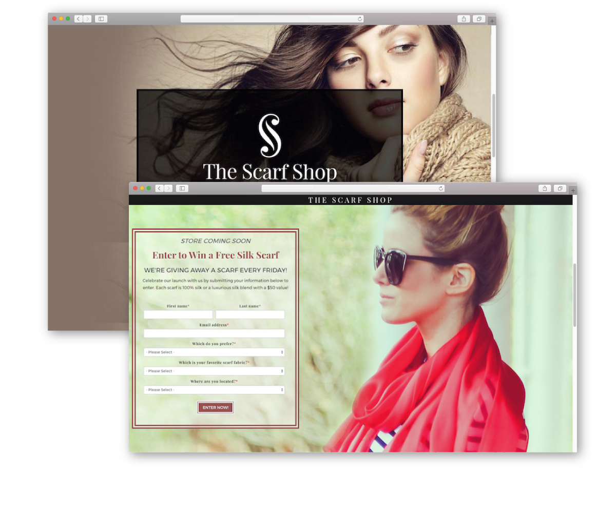
During our first effort, we created a "Coming Soon" campaign in order to build The Scarf Shop's database with marketing qualified contacts and allow their site to have a strong launch. As part of this effort, we created a landing page with a pre-launch offer for a discount of $25 off of a $50 purchase, valid for any purchase on the new The Scarf Shop site.
This landing page did not perform as well as we had hoped. While the click-through rate of 4.5% was still above the industry average of 2-3%, it would not bring the contacts that we wanted for The Scarf Shop. To improve our numbers, we decided to figure out exactly what elements of the landing page led to the low performance and re-evaluate our strategy. We found three key areas of improvement.
With this new information, our team created a second, completely redesigned landing page.
This page performed much better, with the submission rate increasing by a staggering 222% to 14.5 % and the new contacts rate increased by 230% to 13.2%.
Here are the main features that made our second landing page so much more successful.
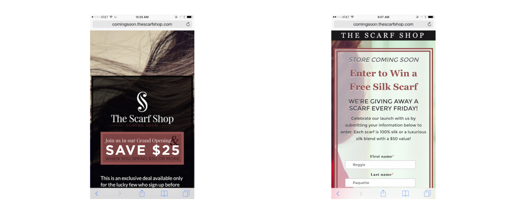
A general rule of thumb is that the length of a landing page should reflect the perceived worth of the offer. An offer for a free house, for example, may be worth extra fields like income, the number of family members, etc. while a simple offer for a free scarf may not be worth much more than a name and email address. Keeping the landing page short and above the fold, then, allows users to see the entire offer, reach the call-to-action and get all of the information that they need without having to scroll or scrutinize. This simple, user-friendly design gives them a positive experience and encourages them to convert.
In the big picture, stock photos are usually less effective than actual images of the product— site visitors want to see the real product in action. In the first landing page, we were forced to use a stock photo because The Scarf Shop didn’t have any product photography and they hadn’t yet built their online brand. For our second landing page, though, we scrapped the stock.
Instead — and as part of our larger inbound marketing strategy— we sent scarves to fashion bloggers so that they could promote The Scarf Shop's products online and send us photos of themselves wearing the scarves. This strategy encouraged engagement with The Scarf Shop and had great results: our new landing page features a real photo from fashion blogger Kim Tuttle wearing the actual product!
Visual cues help the user take the desired action — a bit of subliminal messaging if you will. In our case, we wanted the page visitors to fill out the form. To encourage them, we edited the photo that Kim sent us to make it look like she is looking directly at the form. This subconsciously pushed the user’s gaze to the form and increased the chances that they’ll fill it out.
Every piece of content and material that is associated with an eCommerce retailer should reflect that brand’s voice, tone, color scheme, and overall image. Why? Customers want to give their business to a company that is trustworthy and consistent: if they find an inconsistent site or an off-putting design element, they will likely think that the product is inconsistent as well and be less willing to convert.
When we created our first landing page, The Scarf Shop was still developing its image and voice —and the off-brand page didn’t hit the mark. The new landing page, however, was much stronger, incorporating the branding, design and colors from The Scarf Shop’s various social media profiles. This created a more enjoyable "fill out" experience and reduced friction in the conversion path, encouraging users to convert.
The first discount offer would have been effective for an established brand. However, it was completely inappropriate for a site that isn’t live: we were essentially asking them for their email in exchange for a coupon code they couldn't use for a product they hadn’t seen. In other words, then, it generated neither interest nor conversions.
The second offer—enter to win a free scarf— was much more effective, offering immediate value with no risk. Further, the words "Every Friday" created urgency in the offer, giving users the sense that the earlier they opt-in, the more chances they have of winning. This is much more enticing, motivating the site visitors to provide their information and give The Scarf Shop a try.
The Scarf Shop does most of its marketing through Instagram and other mobile-centric social media channels, meaning that the majority of their traffic is from mobile. It was important, then, for the landing page to be optimized and responsive across devices. This was a central component of our landing page re-design.
On the new landing page, the entire offer and even the first two questions of our form are visible and easy to understand. This may seem like a small difference, but what it comes to attracting traffic and boosting conversions, sometimes it’s the small details that make the biggest difference.
The point then is to continuously optimize, test, and improve your landing pages — and all of your marketing efforts — in order to create content that consistently interests users and encourages them to convert into leads and contacts. Even good content can underperform if it is improperly targeted and optimized, so it is important to always consult analytics and reevaluate in order to achieve top performance and company growth.