.jpg)
Clear Gold is a newly-founded brand that aims to revolutionize the cannabis industry by creating a luxury, customizable experience. They reached out to EYEMAGINE to help them launch their business by providing full-service marketing and web development support. This included assisting with their products, packaging, branding, Shopify website development and marketing.
One of the first, most important steps of this engagement was developing a comprehensive branding strategy and style guide that the company could use to create all of their future marketing, website, and product materials. With these efforts, we were not rebranding an existing company, but rather creating something completely new, ultra-personalized and unique.

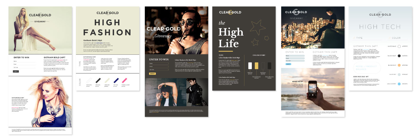
To develop and solidify their branding, our marketing and graphic design experts began by creating three brand & style guide concepts to present to Clear Gold. These were created based on our understanding of their audience and the initial marketing material that they already had. They included key branding elements, including distinct colors, type, look & feel, and logo variations. The purpose of these was to give the company three clear, distinct ideas of who their ideal target persona could be and the directions in which their brand could go.
With this, we had complete autonomy: since we were creating something from scratch, we had the ability to go in three completely different directions, from which we could craft an ultra-personalized, unique final concept.
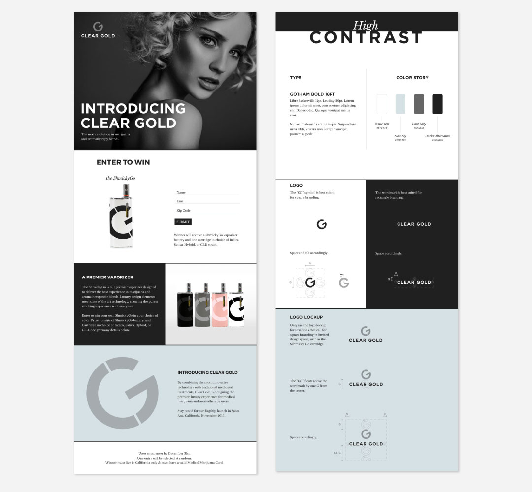
That is exactly what we did. From these three brand and style guides, a fourth, distinct finalized concept was created. The purpose of this mock-up was to provide Clear Gold with a clear, comprehensive guide of what their company, brand and beginning efforts would look like in the initial launch stages.
According to DemandGen Report, 95% of buyers chose a solution provider that 'provided them with ample content to help navigate through each stage of the buying process.'

High Fashion
The first concept was High Fashion. The inspiration for the aesthetic here was, as you might expect, high-fashion brands like Chanel and Fendi. To emulate this look, our designers focused on an overall standoffish, clean tone. This translated to:
Overall, we wanted to get across the idea of strength and differentiation through fashion and glamor.
High Life
The second concept was High Life. Here, we wanted the aesthetic to be dramatic and smokey, with the guiding words and ideas being rooftop, whiskey and smoke, lavish, top shelf, and heritage brands. This translated into:
High Tech
The final concept was High Tech. The main aesthetic here was designer tech, modeled after top brands like Apple: crisp, clean and very clear. This led to examples that used:
The Final Product

The final product incorporated elements from all three concepts to create one cohesive, unique brand. Specifically, it incorporated the High Fashion photography, the cooler colors featured in the High Tech brand, and the darker tone and beginning from the High Life landing page.
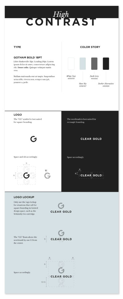
In this final concept, we aimed to create a visual representation of Clear Gold’s high contrast brand and vibe. They essentially have two distinct lines, their “Black Hat” line that contains THC and their “White Hat” line that is strictly aromatherapy products, and we wanted to make sure that this distinction was visually apparent. The high-contrast, black and white aesthetic that we chose aimed to visually combine these unique offerings, using their brand and style guide choices to reflect the dichotomy that exists within the brand itself.
Overall, our approach to this branding and style guide was unique and effective. Generally, when agencies or designers present brand guides, they present a photo, a brand statement, and some typography and colors. With this traditional format, it can be difficult to visualize the finished site and see how the choices will look on the final product. That’s why we chose to present a completed landing page along with the product shots, photography, type, color story and logo lock. This approach gave Clear Gold a publishable sense of what their brand would look like, which will make their long-term design process and subsequent decisions much quicker and smoother.
Are you ready to start the conversation?